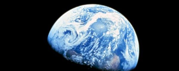
Data

A great infographic on climate change

I already wrote a few times on infographics and how they can be amazing. Indeed, with some of them, a single image is indeed worth a thousand words ( or more ). Here is the latest example I found. It’s explains exactly what has to be done regarding carbon dioxide emissions. And what would be …

A great infographic on climate change Read More »

Policy makers: to create jobs, invest in cleantech

Ever since I created a Facebook page for this website, I have been sharing stuff from non governmental organizations. This allowed me to find a compelling image about an oft missed argument about cleantech : it creates lots of jobs. So to data gathered by 350.org, investing one million dollars would create 5 jobs in …

Policy makers: to create jobs, invest in cleantech Read More »

D-Light, data through illumination

To GOOD : ” One German physicist, Harald Haas, has come up with a solution he calls “data through illumination” (…) by sending data through an LED lightbulb that varies in intensity faster than the human eye can follow.” ” It’s the same idea behind infrared remote controls, but far more powerful. Haas says his …

D-Light, data through illumination Read More »

How green is the iPhone ?

This is the question one might ask as there are so many of them nowadays. Geekaphone answers this with a brilliant infographic by having a close look at its fabrication and lifecycle. Did you know that during its lifecycle, an iPhone 4 will emit the equivalent of 45 kgs of carbon dioxide ? 57 % …

How green is the iPhone ? Read More »

An image is worth a thousand words

Nothing could be more true with infographics as they combine data and images. As Cool Infographics notes  “Charts and graphs can communicate data; Infographics turn data into information.” This is a fantastic tool to understand complex topics like energy in general or for example how the United States rely too much on foreign oil and  …

An image is worth a thousand words Read More »

%d bloggers like this: